Section 1 of 5 · 12 min read
The Narrative Gap: Why Evidence Isn't Enough
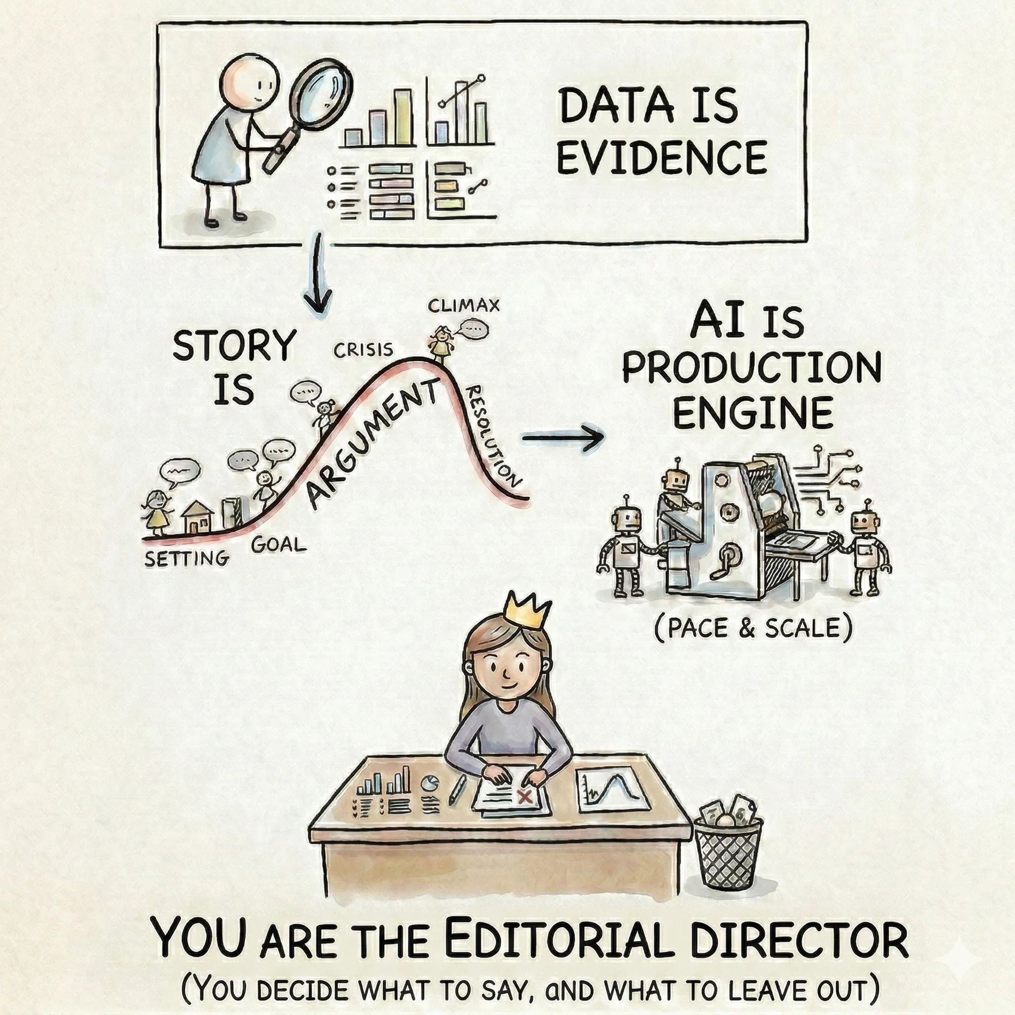
The evidence for climate action has been overwhelming for decades. And yet the gap between what experts know and what people feel compelled to act on keeps widening. The bottleneck is not data — it's story.
The data-action gap
Think about the arc of climate communication over the last thirty years. Each decade, the scientific evidence has grown more precise, more comprehensive, and more alarming. Each decade, the communications have gotten more sophisticated — better charts, better data visualization, more accessible summaries. And each decade, the response has remained disproportionate to the threat.
This is the narrative gap: the persistent, measurable distance between the quality of the evidence and the urgency of the response. It is not a gap that more evidence closes. It is a gap that only better storytelling can bridge.
A 2021 Gartner report found that organizations with advanced storytelling capabilities were 40% more likely to achieve their strategic objectives than those presenting data without narrative context. The underlying mechanism is well-studied: when people engage with a well-constructed narrative, they enter a psychological state called narrative transportation. Their critical defenses quiet. They stop counter-arguing. They become open to persuasion in a way that a bar chart, however accurate, cannot achieve.
Narrative-based interventions have been shown to be nearly twice as effective at changing behavior compared to traditional public service announcements. The data is not the problem. What's missing is the structure that gives data meaning.
The information you share is not what changes people. The meaning you create from it is.
Three myths that trap climate communicators
Before you can build better stories, it helps to diagnose why the default approach keeps failing. Three persistent myths are responsible for most of it.
Myth 1: Good data speaks for itself
This is the most persistent assumption in climate communication: if you present the evidence clearly enough, people will understand and act. The evidence for why this fails is everywhere. Consider China's emissions: the same underlying data tells completely different stories depending on whether you use absolute, per-capita, cumulative, or GDP-adjusted framing. China appears as the “biggest emitter,” “middle of the pack per person,” and “far behind the US in historical responsibility” — all from the same dataset.
Data contains many potential stories and tells none of them by itself. You can produce a perfectly clean dataset, a well-chosen hero metric, and a beautifully designed chart — email it to a policymaker with the subject line “Q3 Emissions Data Update” — and it sits unread alongside other unreads. Everything about the analysis was sound, and yet nothing in the presentation gave the reader a reason to care about it right now.
Myth 2: Audiences want solutions
The instinct in most climate communications is to open with the achievement: “We reduced emissions by 37%” or “Our platform monitors 50 million hectares.” These are meaningful accomplishments, and they are almost always the wrong way to begin a story.
Without the struggle that preceded the achievement, your audience has nothing to root for. They haven't earned the relief of the resolution because they never felt the tension. Think about every compelling climate story you've encountered. Was it about the finished solar farm, or the fight to get it built against regulatory opposition? Was it about the final emissions number, or the team that uncovered the data manipulation that hid the real figure? The obstacle is where the story lives. Identification with a character or cause happens through shared difficulty, not shared triumph.
Myth 3: Complexity signals credibility
The instinct to include more is one of the hardest to unlearn. Climate professionals work with genuinely complex systems, and the fear is that simplifying means losing nuance, losing accuracy, losing credibility. So the default is to add another data point, caveat, proof.
Simplifying is not the same as dumbing down. It means making deliberate choices about what to leave out so that what remains can actually land. Every additional data point that doesn't directly serve your argument dilutes the ones that do. A story that tries to cover five themes covers none of them well. The most credible climate communicators are not the ones who show the most evidence — they are the ones who select the right evidence and give their audience time to absorb it.
A room full of climate scientists may want the full methodology. A city council deciding on adaptation funding needs one clear finding, its implications, and what it means for their constituents. Knowing your audience determines how much complexity serves the story and how much buries it.
What stories do that data can't
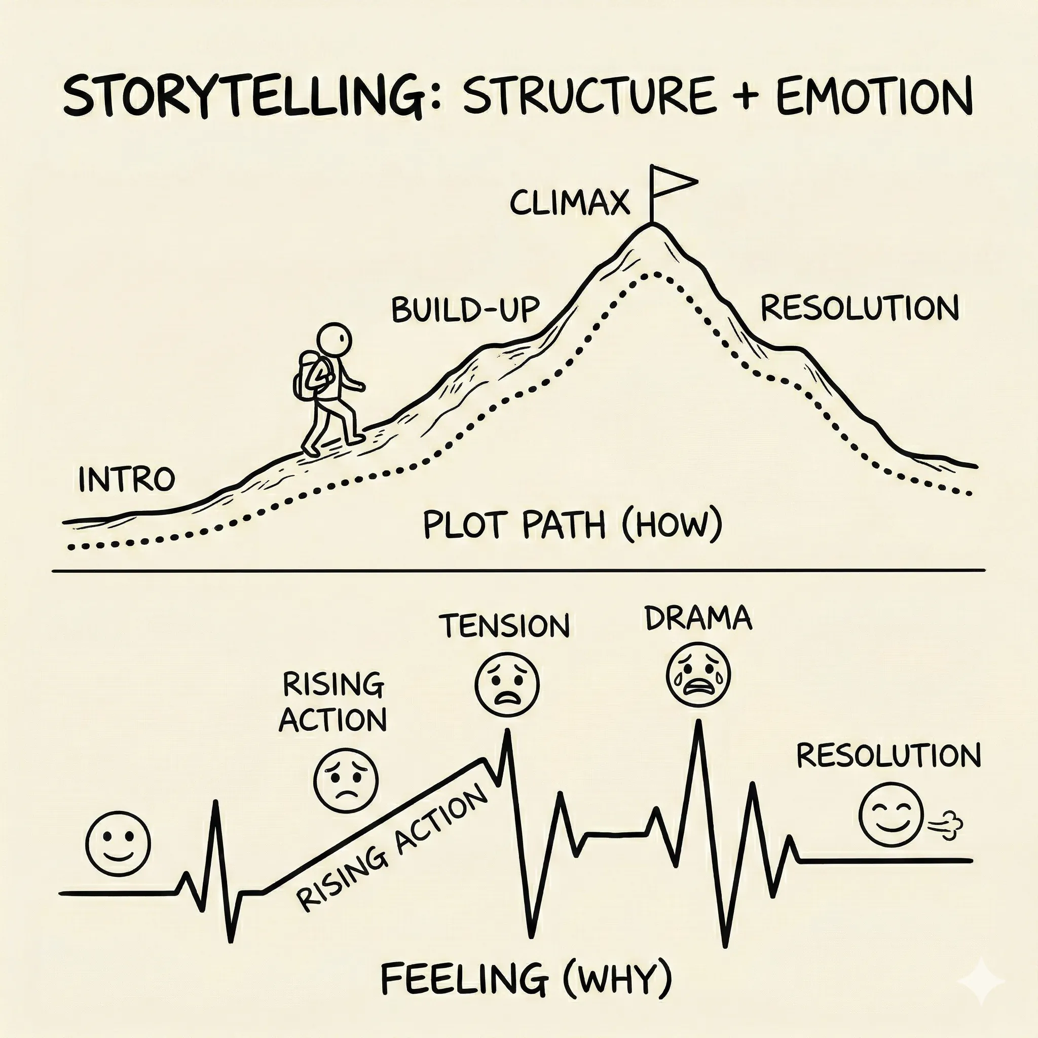
Storytelling is a rigid causal structure delivered with emotional resonance. It is a skill that can be learned, a craft with rules, components, and a repeatable process — just like any technical skill. Most professional communications have structure (introduction, body, conclusion) but lack emotion (stakes, tension, resolution). Most personal stories have emotion but lack structure. Effective storytelling demands both simultaneously.
The key distinction is what stories do at the level of the brain. When people engage with a well-constructed narrative, three things change. First, the critical, skeptical part of the brain quiets. Second, they stop counter-arguing — instead of thinking “but what about...” they're experiencing the story from the inside. Third, attitudes and behavioral intentions shift because the audience has felt the evidence emotionally rather than simply processed it analytically. This effect persists: research by Oschatz and Marker (2020) found that narratives produce stronger persuasive effects both immediately and at delayed measurement, compared to information-based messages.
Stories also do something structurally different from data: they build causal chains rather than timelines. This is the most practical distinction to understand before learning any narrative framework.
The “and then” vs. “because of that” test
Here is the single most useful diagnostic for your own communications. Read through any presentation, report, or pitch you've recently written. Between each section, ask: is the connection “and then” or “because of that”?
An “and then” sequence reads as a timeline: “We analyzed the data. And then we built a model. And then we created recommendations.” Each event follows the previous one chronologically, but there's no spine — no sense that one thing caused the next.
A “because of that” sequence reads as a causal chain: “We analyzed the data. Because of that, we discovered that 80% of adaptation finance never reaches the communities with the highest climate risk. Because of that, we designed a model that routes funding through municipal governments instead of national ones.” Each beat is a consequence of the previous one. The narrative has forward motion. Events are unfolding, not being listed.
Causality is what separates a story from a timeline. If your communication fails the “because of that” test — if you can't connect each element to the one before it through cause and effect — it doesn't yet have a spine.
Causality is what separates a story from a timeline. If every beat connects with “and then,” you have a list. When they connect with “because of that,” you have a story.
The storytelling pre-flight checklist
Before moving on to the mechanics of story structure in the next section, use these seven questions as a diagnostic on any communication you're currently preparing:
- 1
Does it have a struggle? What's the obstacle? What's at stake? What happens if you fail?
- 2
Does it follow a causal chain? Can you connect each beat with "because of that..." instead of "and then..."?
- 3
Do I know my ending before I start? What specific emotion or action do I want to leave the audience with?
- 4
Is it ruthlessly focused? Does every element serve the core narrative? Have I stripped away everything interesting-but-irrelevant?
- 5
Does every data point advance the argument? Is each number a hero metric that moves the story forward, or is it noise?
- 6
Is it designed for the audience? Am I presenting what they need to understand, in language they use?
- 7
Would my audience feel something, or just learn something? Information changes minds. Transportation changes behavior.
Apply it now
Take a recent climate communication — a pitch, a report summary, a social post — and run the “and then” vs. “because of that” test on it. The Bullet Point Test exercise will show you exactly what transforms a list into a story.
Exercise
Bullet Point Test
Transform a bullet-point list into a causal narrative