Section 2 of 5 · 15 min read
The Architecture of Stories
Once you accept that causality is what separates a story from a list, the next question is practical: how do you build that causal chain reliably? The answer comes from an unexpected source.
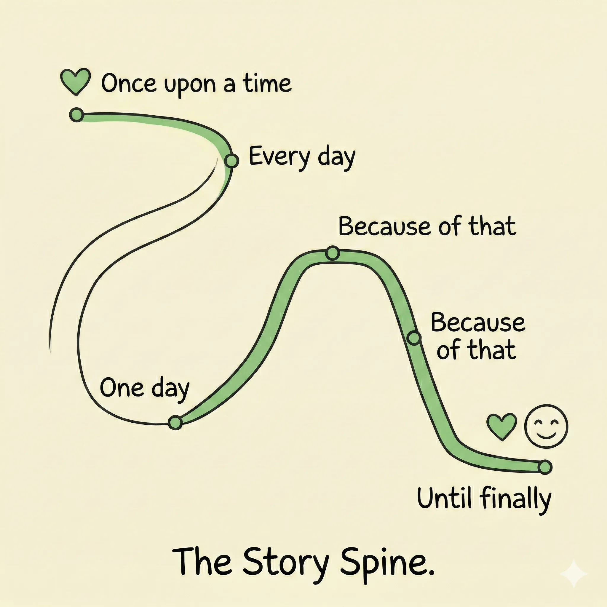
The Pixar Story Spine
Emma Coats, a former Pixar story artist, distilled 22 rules of storytelling from her time at the studio. At the heart of them sits the Story Spine — a universal structure that applies to everything from an animated film to a climate tech elevator pitch. The structure has six beats:
Once upon a time…
Context. The status quo. The world before anything changes.
Every day…
The routine. The problem as normal. What life looks like before the disruption.
One day…
The inciting incident. The disruption that breaks the routine and demands response.
Because of that…
The first consequence. The world responds to the disruption.
Because of that…
Consequences compound. The chain deepens — stakes rise.
Until finally…
The resolution. Transformation. What the world looks like after the struggle.
This structure does something most professional communications fail to do: it establishes what exists before it introduces what changed. Most pitches, reports, and presentations skip straight to the solution. The Story Spine forces you to build the world the audience lives in first, so that when the disruption arrives, it means something.
Notice the repeated “because of that.” That phrase is doing the critical work. It demands that every beat connects to the one before through cause and effect — not just chronology.
What each beat is actually doing
Each beat in the Story Spine serves a specific psychological function. Understanding what each one does — not just what it says — makes the difference between a story that lands and one that just sounds structured.
Once upon a time / Every day establishes the stakes by first establishing the norm. Before your audience can care about disruption, they need to understand what's being disrupted. This is the world they recognize — the community, the ecosystem, the system — functioning as expected. Without these beats, there is no before, and without before, there is no change.
One day is the engine of urgency. Something breaks the routine. A species crosses an extinction threshold. A city records its first heat death in a hospital that was never designed for heat. A monitoring system detects an anomaly that can't be explained away. This beat answers the question every audience asks, consciously or not: why am I hearing about this now?
Because of that / Because of that builds the consequence chain. These beats do the work that most climate communications skip: they show the audience what the disruption means, specifically, for people the audience can identify with. Consequences compound. Pixar Rule 16 applies here: ask what happens if the character doesn't succeed. Stack the odds. When the audience can see what failure looks like, stakes emerge. With stakes, they stay transported.
Until finally provides the resolution and, critically, the agency pathway. This is where fear (used correctly in the earlier beats) converts to action. Research distinguishes between hope for climate action and hope that the problem will resolve without action. The first motivates. The second demotivates. Until finally must show the audience their role in creating the outcome — not just that a good outcome is possible.
The hero is almost always the audience
One of the most common structural errors in climate communication is choosing the wrong hero. Most climate stories are told from the perspective of the scientist, the NGO, the technology, or the planet. In almost every case, this is a mistake.
The hero of a story is the character who must change — the one who faces the obstacle, makes the choice, and is transformed by the resolution. When you make the scientist the hero, the audience watches someone else's struggle. When you make the audience the hero — the city council member, the investor, the parent, the voter — the struggle becomes theirs. The agency is theirs. The transformation is theirs.
This has a direct implication for how you construct the Story Spine. Know exactly what emotion or action you want your audience to land on before you draft the middle. Work backwards from that ending. Every beat, every data point, every example needs to be a step in the causal chain that lands at that specific destination. A beautiful chart about global deforestation trends, however accurate, might not earn its place in a story for a city council audience deciding on urban tree canopy funding.
Know your ending before you write your beginning. Define the specific emotion or action you want your audience to arrive at — then build backwards.
A worked example: GLAD deforestation alerts
The Global Land Analysis and Discovery (GLAD) system detects tree cover loss using satellite imagery and issues near-real-time alerts when forest is cleared. Here's what a report on GLAD typically looks like, and what happens when it's rewritten as a Story Spine.
Standard report version:
“The GLAD alert system detected 2.3 million hectares of forest loss in the Amazon basin in Q3, a 14% increase over Q3 of the prior year. The data is available in the Global Forest Watch dashboard. Governments and certification bodies are advised to review these figures.”
Story Spine version:
Once upon a time…
Certification bodies relied on annual government forest reports — data that arrived 18 months after the fact, when it arrived at all.
Every day…
Buyers, investors, and regulators approved supply chains based on outdated information, with no way to know whether the forest that was certified last year still existed.
One day…
GLAD satellite alerts began detecting cleared forest in near real-time — within 8 days of loss events — covering the entire Amazon basin.
Because of that…
For the first time, a soy trader in Rotterdam could see, on a Tuesday, that a supplier cleared protected forest the previous Thursday.
Because of that…
Certification bodies faced a choice: integrate the real-time data into their auditing process, or risk certifying supply chains they knew were non-compliant.
Until finally…
Three major certification bodies integrated GLAD alerts into continuous monitoring — making the gap between satellite data and supply chain accountability, for the first time, measurable and publicly reported.
The evidence is identical in both versions. The difference is the causal chain. In the report version, nothing causes anything else. In the Story Spine version, every beat is a consequence of the one before it. The reader arrives at the resolution feeling like it was earned — because it was.
Visualization as narrative
The Story Spine isn't just for written content. It applies to charts and data visualizations too. The difference is in the annotations.
Consider these two annotations on the same emissions chart:
A label: “India's solar capacity increased rapidly after 2017.”
A narrative annotation: “2017: Reverse auctions drive solar prices below coal for the first time. India's trajectory changes permanently.”
The first describes what happened. The second explains why — and implies what comes next. When you annotate a chart with the inciting incident, the reader's mind automatically reaches for “because of that” without you writing it explicitly. That is the Story Spine operating at the level of a single visualization.
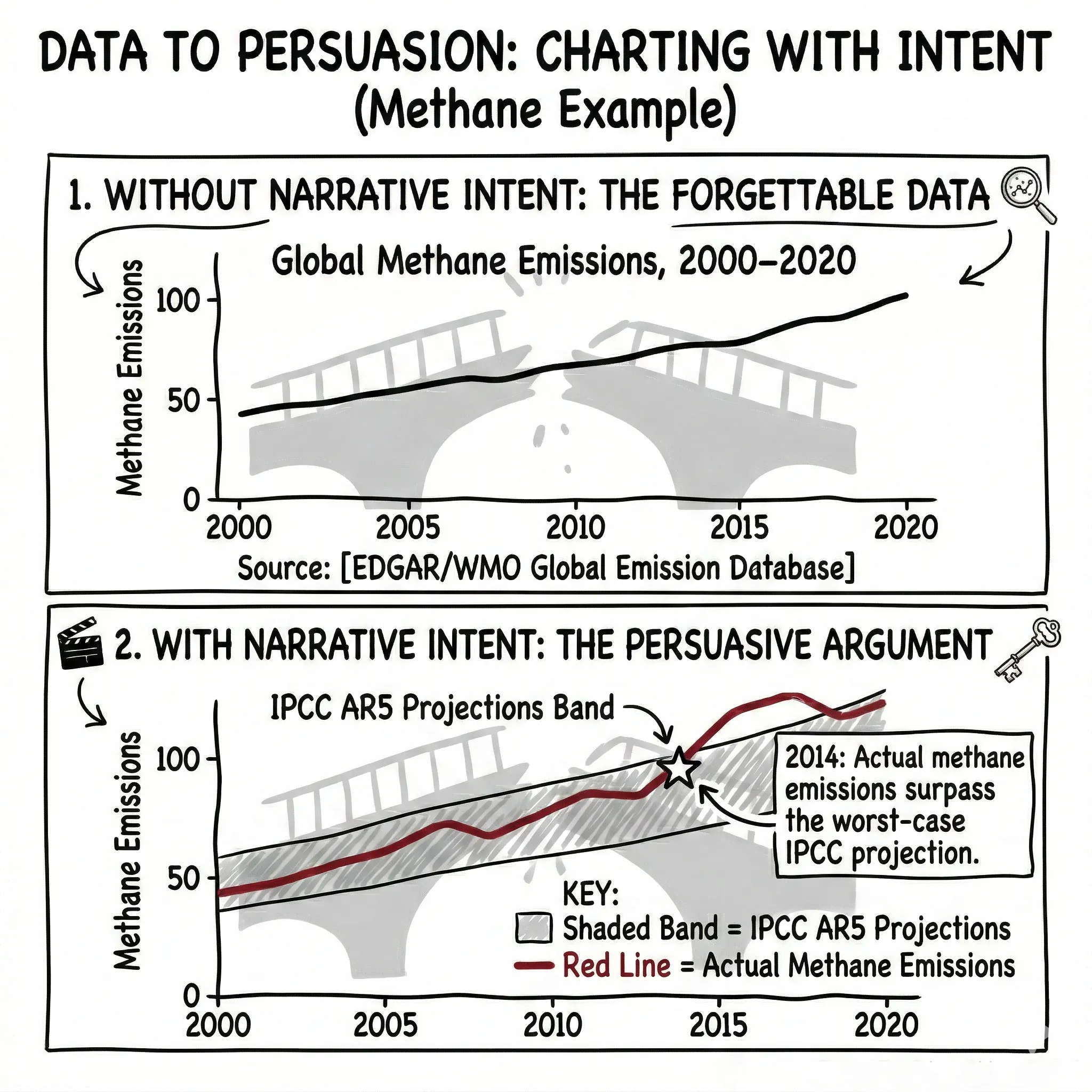
The shaded band above supplies the “Every day.” The breakout line is the “One day.” A well-annotated chart tells the Story Spine without words.
Apply it now
Take a climate case you know well and apply the six-beat Story Spine to it. The builder will guide you through each beat, check the causal connections, and show you the difference between a timeline and a story.
Exercise
Story Spine Builder
Apply the Pixar Story Spine to a real climate case